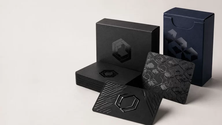
A packaging finish changes more than the look of a box. It can influence how colours appear, how the surface feels, how the print handles regular use and, depending on the construction, how easy the pack is to recycle.
For UK brands, the challenge is not finding finishing options. It is choosing the right one for the board, artwork and product.
Matt and gloss lamination affect most of the printed surface. Soft-touch adds a tactile feel. Spot UV, foil stamping, embossing and debossing are usually better for drawing attention to selected details such as a logo, product name or pattern.
Quick answer: There is no single best packaging finish. Start with the material and artwork, then decide whether you need shine, texture, protection or a focal detail. One well-chosen finish often works better than several competing effects.
What Are Packaging Finishes?
Packaging finishes are treatments applied to printed packaging to change its final surface, texture or appearance. They are different from the material and printing method.
- Material: the board the box is made from.
- Printing: reproduces the artwork and colour.
- Finish: changes how the printed surface finally looks or feels.
That distinction matters because the same finish does not behave identically on every substrate. White paperboard gives a cleaner, more neutral base than natural kraft. Corrugated board has different surface characteristics, while rigid packaging offers more scope for wrapped papers and tactile finishing.
Before choosing from different packaging finishing options, decide what the finish needs to achieve rather than selecting it simply because it looks impressive on a sample.
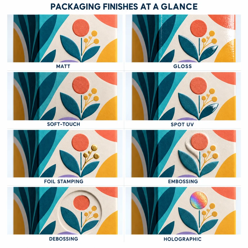
Packaging Finishes at a Glance
| Finish | Typical effect | Often suits | Main consideration |
| Matt lamination | Smooth, low-shine | Minimal and premium designs | More restrained appearance |
| Gloss lamination | Bright, reflective | Colour-rich artwork | Can create glare |
| Soft-touch lamination | Velvety surface | Luxury presentation | Should add genuine value |
| Spot UV | Selective gloss | Logos, patterns, titles | Accurate registration needed |
| Foil stamping | Metallic or coloured detail | Premium branding | Best used selectively |
| Embossing | Raised design | Logos and typography | Artwork detail matters |
| Debossing | Recessed design | Kraft and minimal styles | Strong tactile effect |
| Holographic finish | Colour-shifting reflection | Statement packaging | Can dominate subtle designs |
This table is a starting point rather than a fixed rule. The right choice depends on the complete packaging specification.
Lamination Finishes Explained
Lamination adds a surface layer to printed packaging and can change both appearance and handling performance.
Matt Lamination
Matt lamination creates a smooth surface with reduced reflection. It suits brands that want a restrained look rather than a glossy one. Cosmetics, candles, gifts and minimalist retail packaging often use matt surfaces because typography and simple graphics remain the focus. Matt should not automatically be described as more luxurious. Its strength is subtlety.
Gloss Lamination
Gloss lamination creates a brighter, more reflective surface. It can make colourful artwork and photography appear more vivid, making it useful for designs that rely on visual impact. The trade-off is glare. Under strong retail lighting, small text may become harder to read, so readability should be checked alongside appearance.
Soft-Touch Lamination
Soft-touch lamination is chosen mainly for tactile effect. It gives the surface a smooth, velvety feel that works well for premium gifts, beauty products and high-end presentation packaging. On rigid packaging, tactile finishes can work alongside foil, embossing and Spot UV. Soft-touch should still have a clear purpose. If physical handling is not important to the customer experience, a simpler finish may be enough.
Matt vs Gloss vs Soft-Touch: Which Should You Choose?
The choice should follow the artwork and brand positioning. Use matt for restrained colours, typography-led layouts and minimal design. Choose gloss when photography, bright graphics or colour saturation are central to the artwork. Consider soft-touch when the feel of the packaging supports the product’s premium positioning.
The structure matters too. A well-made box with poor artwork will not become premium simply because a luxury finish is added.
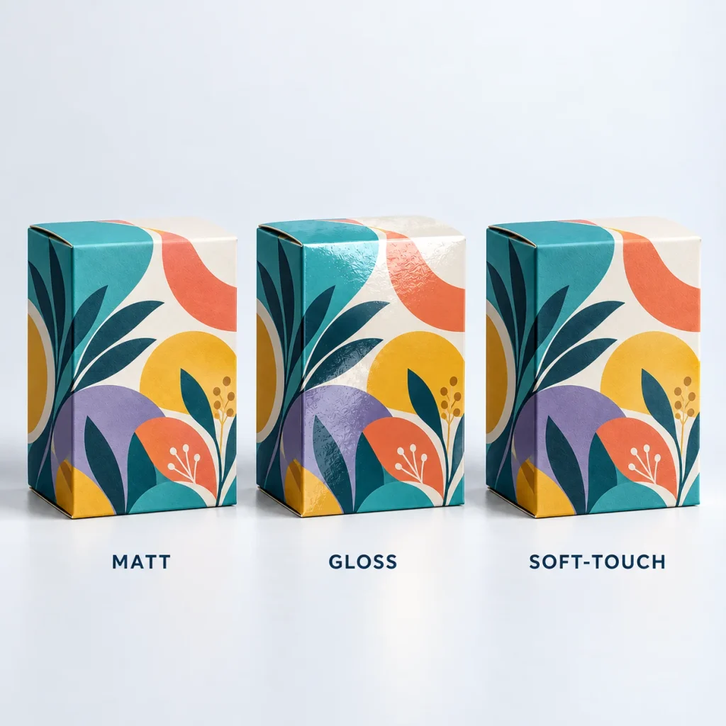
Three identical printed folding cartons shot side by side under the same angled studio light, with accurately differentiated low-sheen matt, reflective gloss and subtle velvety soft-touch surfaces. Close crop makes surface texture legible.
What Is Spot UV on Packaging?
Spot UV adds gloss to selected areas instead of covering the whole surface. It is often used for logos, product names, patterns, illustration details and selected typography. The effect is especially noticeable over a matt background, where the glossy section creates contrast as the box catches the light.
When Spot UV Works Best
Spot UV works well when the design already has a clear focal point. A logo, subtle pattern or short piece of typography can gain depth without adding another colour.
When Spot UV Is Unnecessary
It is less effective when the design is already crowded. If multiple colours, foil, illustrations and strong typography are competing for attention, Spot UV may simply add visual noise. The purpose is contrast, not decoration for its own sake.
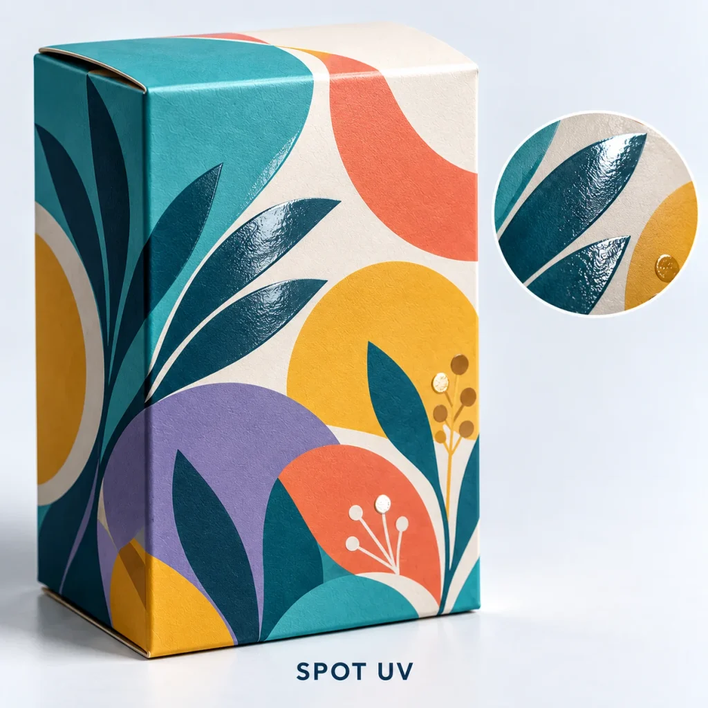
Macro, angled product photograph of one dark matt carton with selective clear Spot UV only on a simple logo and quiet background pattern; raking light reveals the gloss while the surrounding panel remains matt.
Foil Stamping for Packaging
Foil stamping applies metallic, coloured or speciality foil to selected parts of the box. Gold and silver are familiar options, but coloured, copper and holographic foils can also be used. Foil works best for logos, borders, product names and controlled decorative details. The scale matters. A small foil accent can create a stronger premium signal than covering most of the panel.
For a product example, see foil-stamped candle boxes. Board colour also affects the result. Gold foil on natural kraft creates a very different look from the same foil on white or black stock.
Embossing vs Debossing: What Is the Difference?
Embossing and debossing change the physical surface of the box. Embossing raises the design above the surface. Debossing presses the design into the material. Both work well for logos, lettering and simple patterns.
Embossing creates a more noticeable raised feature, while debossing can feel quieter and more understated. For natural substrates, debossing can be especially effective because the board remains part of the visual identity. Brands considering kraft packaging options can use tactile finishes without covering the material with heavy graphics.
Very fine detail needs care. Extremely small lettering or complex artwork may not reproduce cleanly as a raised or recessed effect.
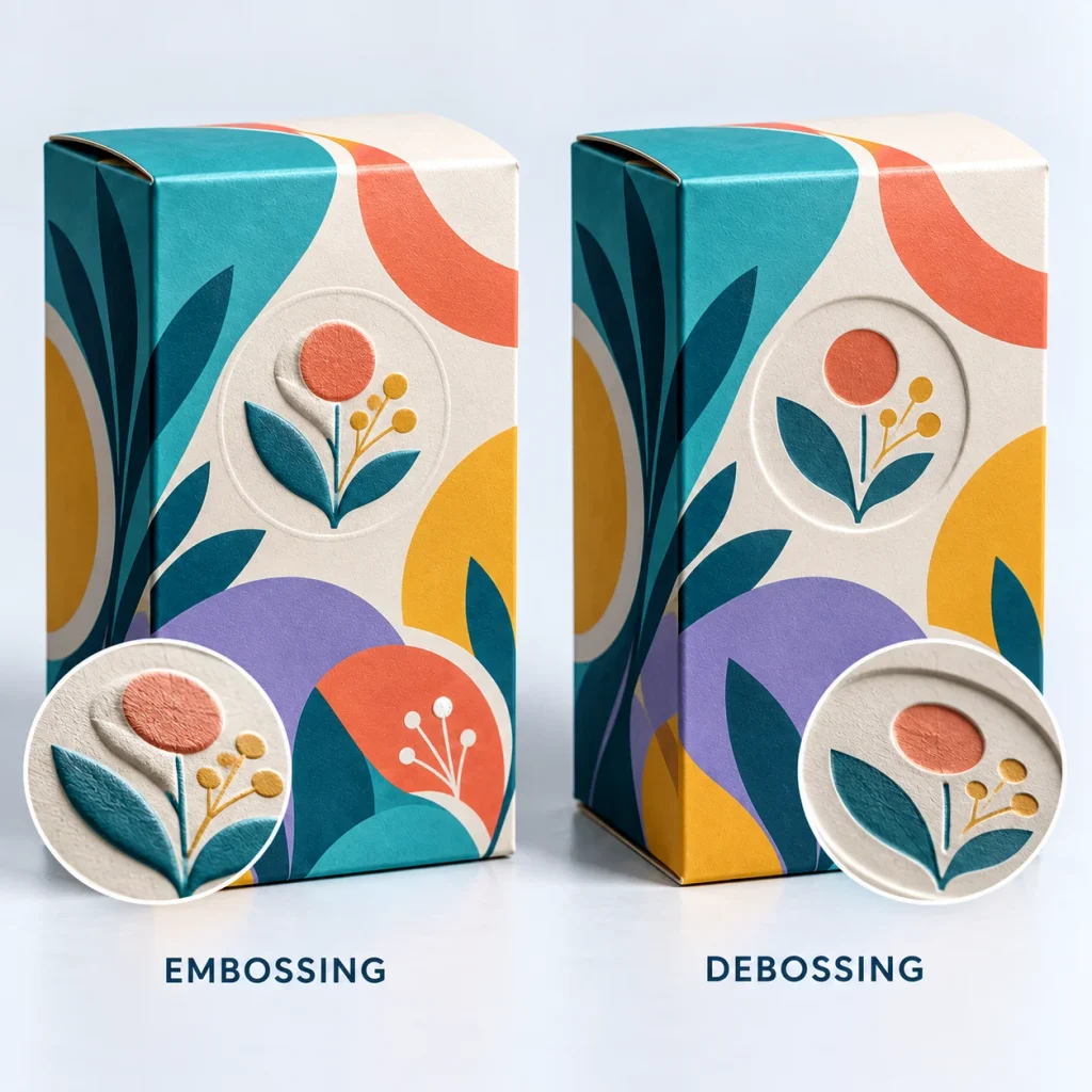
Extreme close-up of two uncoated kraft carton panels side by side with the same simple geometric mark: physically raised emboss on one, clearly recessed deboss on the other. Side lighting reveals actual board deformation, not printed shading.
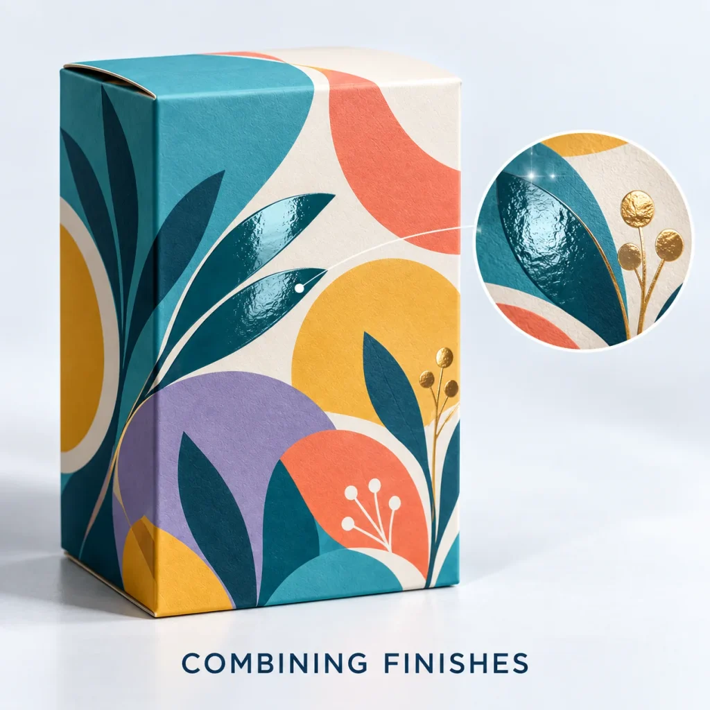
Can You Combine Packaging Finishes?
Yes, but more finishes do not automatically improve the box. Certain combinations work because each technique has a different role.
Matt Lamination + Spot UV
The matt base keeps the box restrained while Spot UV highlights selected details.
Foil + Embossing
Foil adds reflection while embossing adds physical depth.
Soft-Touch + Foil
Soft-touch changes the overall feel while foil provides a clear focal point.
Kraft + Debossing
This creates a simple, tactile result without relying on heavy colour coverage.
The key is restraint. If foil, Spot UV, embossing and holographic effects all compete on the same panel, the box can feel less considered rather than more premium.
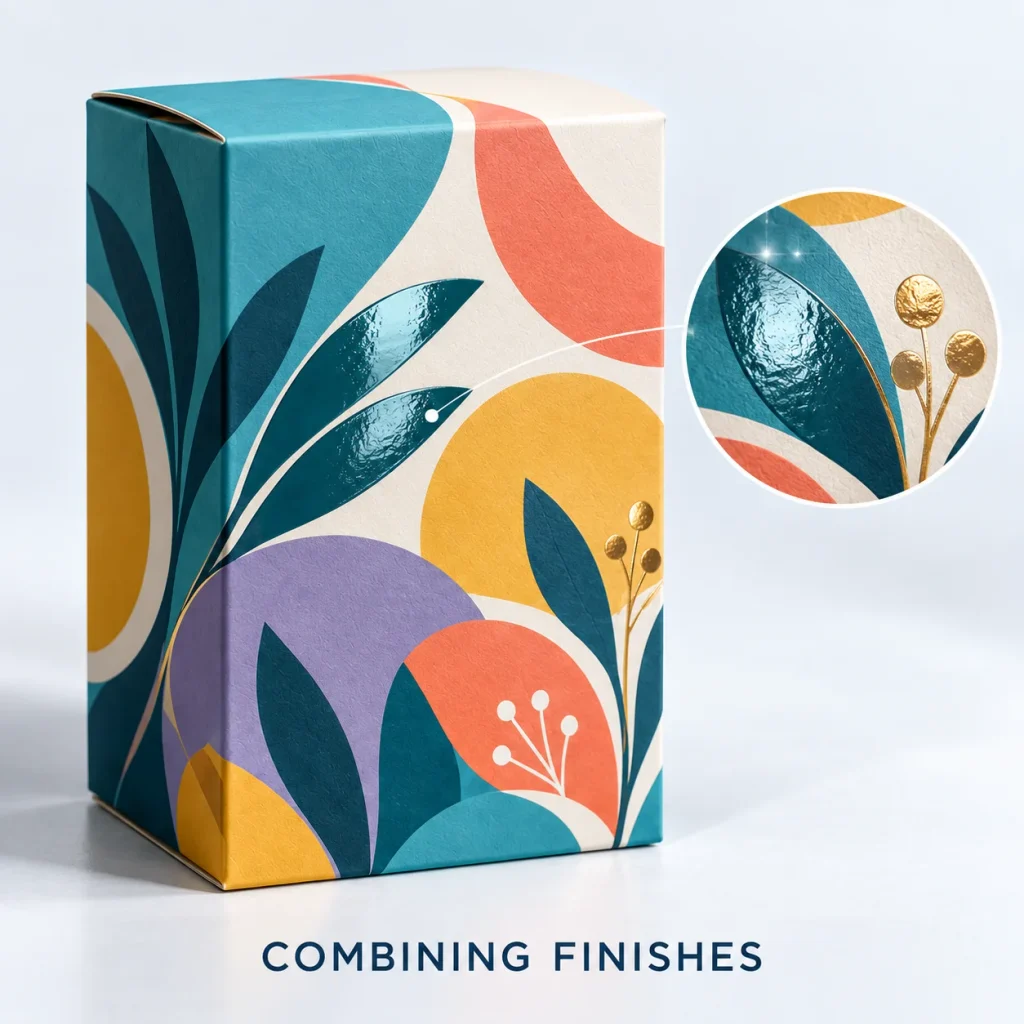
How Packaging Material Changes the Finish
Choosing a finish before confirming the material can create unrealistic expectations.
White Paperboard
White board provides a neutral base and broad flexibility for colour printing, lamination and decorative finishing.
Kraft Board
Kraft has a natural brown tone, so printed inks appear differently from those on white board. That difference can become part of the design. Foil, embossing and debossing can create contrast while keeping the natural surface visible.
Corrugated Board
Corrugated packaging is often selected first for strength. The liner surface and flute construction influence how fine details and some finishes reproduce. A finish suited to a small folding carton may not be appropriate for a heavily handled shipping box.
Rigid Board
Rigid packaging allows more scope for wrapped surfaces, foil, embossing and soft-touch effects. The finish should still support the box construction rather than compensate for weak design.
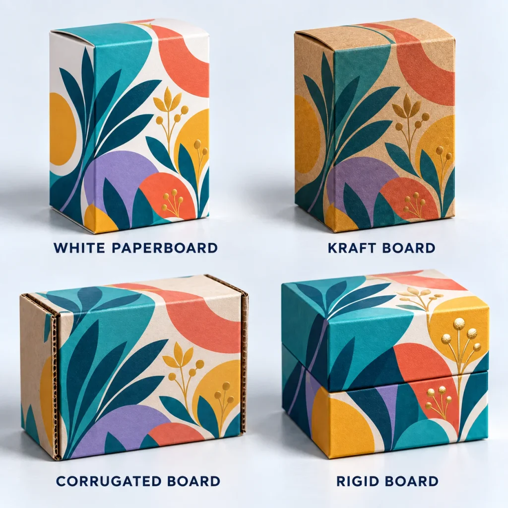
Which Packaging Finish Works Best by Product Type?
There are useful starting points, but no finish should automatically be assigned to an industry.
| Product type | Useful starting direction |
| Cosmetics | Matt or soft-touch with selective foil/Spot UV |
| Candles | Matt, foil, embossing or debossing |
| Gifts | Soft-touch, foil or embossing |
| Retail cartons | Matt or gloss depending on artwork |
| Ecommerce | Durability first, accents selectively |
| Kraft packaging | Foil, debossing and restrained print |
These are starting points only. The final choice should follow the board, artwork, product positioning and handling conditions.
How Finishes Affect Printed Colours
A colour approved on a monitor will not always look identical in print. Material, ink, printing method and finishing all influence the result. Gloss can make some colours appear brighter because of its reflective surface. Matt reduces glare and can make the same artwork feel more restrained. Kraft introduces a warmer background tone, which changes how inks appear.
This is particularly important when a brand uses tightly controlled corporate colours. If colour consistency matters, Pantone references, proofing and the final board should be considered before production. Brands developing artwork and finishes together can use packaging design support to coordinate the dieline, artwork and finishing areas.
Packaging Finishes for Small UK Brands
Small businesses do not need several premium finishes to make their packaging look professional. Start with strong structure, accurate sizing and clear artwork. Then decide which detail deserves emphasis. For one brand, that may be a foil logo. For another, a simple matt carton with strong typography may already communicate the right message. Finishes should support the brand, not replace it.
Do Packaging Finishes Affect Recyclability?
They can. The recyclability of finished packaging depends on the complete construction, not just the board. Films, coatings, adhesives, windows and other added materials can all influence how easy the pack is to process after use. That is why phrases such as “eco-friendly finish” should be used carefully. If recyclability matters, check how the treatment works with the substrate and whether separate components need removing. Simpler material combinations are often easier for customers to understand.
Common Packaging Finish Mistakes
- Adding too many finishes: More effects do not automatically mean higher quality.
- Choosing a finish before the material: The substrate changes how the finish looks.
- Using foil everywhere: Large metallic areas can overpower artwork that only needed one focal detail.
- Applying Spot UV to tiny details: Fine elements may not create enough visual contrast.
- Ignoring kraft colour: Natural board is not the same starting surface as white paperboard.
- Approving only from a screen: Screens cannot show tactile feel, reflection or actual substrate colour.
- Forgetting handling: A presentation box and a frequently handled shipping carton need different considerations.
- Assuming premium means more: Premium packaging often comes from fewer, better-controlled decisions.
Should You Request a Packaging Sample?
Digital proofs are useful for checking layout, copy and artwork placement. A physical sample becomes more valuable when the finish itself matters. Consider one when you need to assess soft-touch feel, foil colour, emboss or deboss depth, Spot UV placement, substrate colour or how several finishes work together. Ask your supplier which proof or sample formats are available for the exact board and finish combination.
Custom Packaging Finishes From Hi Custom Boxes
Hi Custom Boxes works with UK brands across folding cartons, kraft boxes, corrugated packaging and rigid structures. Depending on the specification, finishing options can include matt and gloss lamination, soft-touch treatments, Spot UV, foil stamping, embossing, debossing and holographic effects.
The useful question is not “How many finishes can we add?” It is “Which finish improves this particular box?” A strong packaging specification brings the board, printing, artwork and finish together rather than treating them as separate decisions.
Final Checklist Before Choosing a Packaging Finish
Before approving the specification, ask:
- What board are we printing on?
- What should customers notice first?
- Is the finish decorative, protective or tactile?
- Does the artwork suit the technique?
- How heavily will the box be handled?
- Does colour need tight control?
- Could the finish affect recyclability?
- Have we checked a suitable proof or sample?
- Is the finish improving the design or simply adding complexity?
If there is no clear reason for an effect, the packaging may be stronger without it.
Need packaging advice for your next order?
Share your box size, material, quantity, and artwork needs. Our team can guide you before production starts.